Industry
Peer-to-Peer Rental Platforms
Timeline
2025.02-present
Role
Founding Product Designer – UX Strategy, Visual Design, Rapid Prototyping, User Testing
Tools
Figma, ProtoPie, Midjourney, ImageFX
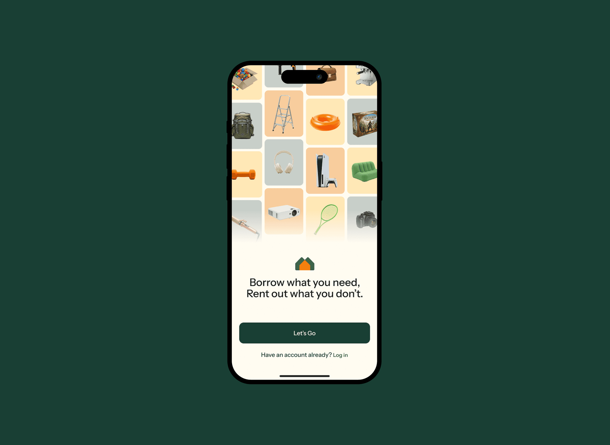
Redesigning Trust & Identity for a Peer-to-Peer Rental Platform
Leading onboarding optimization and brand refresh to drive user trust, retention, and clarity in mission.
Context
I joined Nearville as a founding product designer just before our MVP launch, drawn to the mission of helping neighborhoods thrive through meaningful and trusted sharing.
Since day one, I’ve been leading the design of our website, onboarding experience, and full rebrand, working closely with engineers, marketers, and our CEO to bring it all to life. We’re now live in the market, and I’ve been juggling this work alongside grad school.
What drives me is collaboration and speed. I move fast, test often, and care deeply about both clarity and craft. Lately, I’ve been leading user testing with college students to validate our flow and sharpen what comes next.
Section 1 - Onboarding Experience Optimization
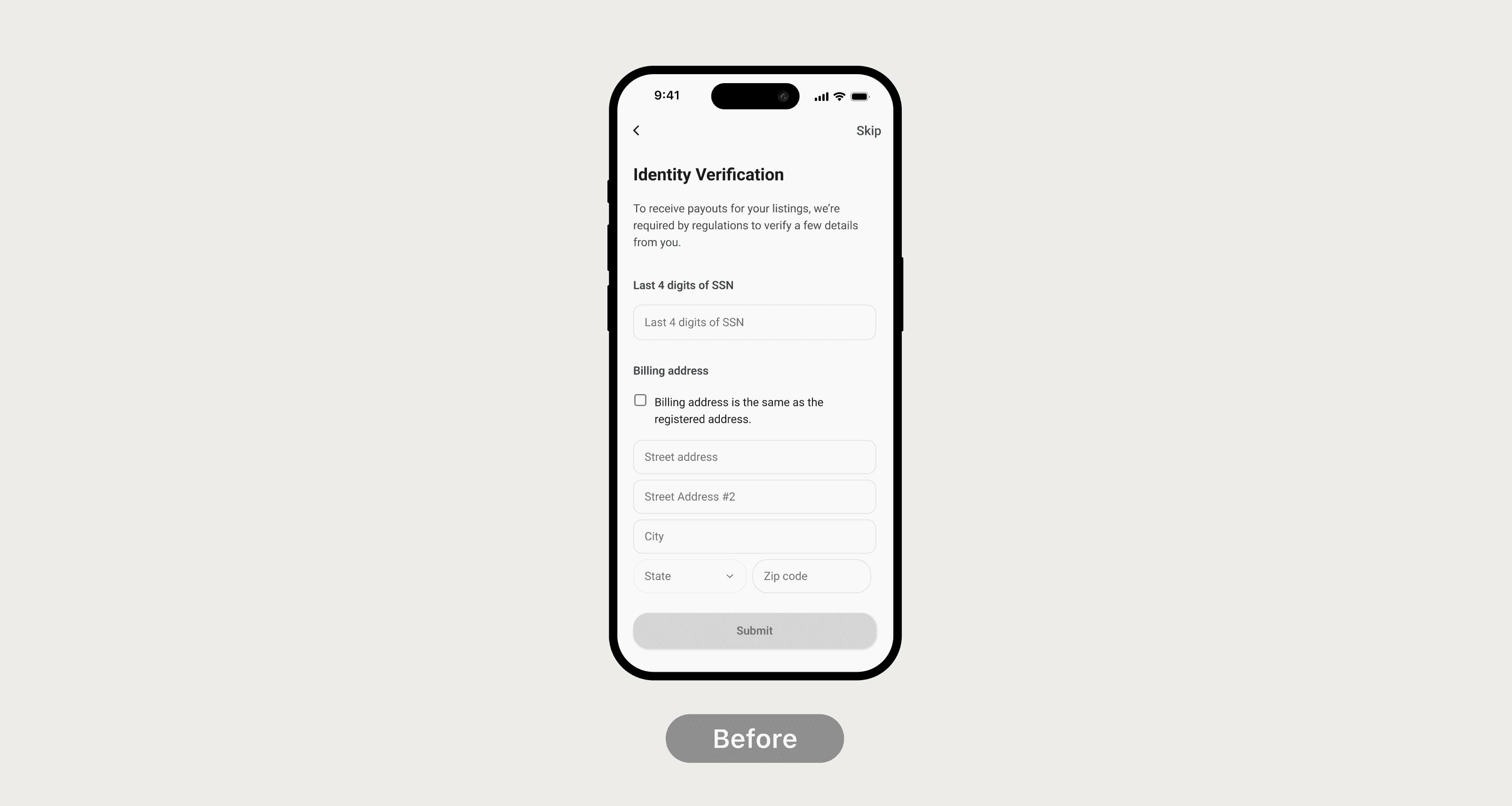
Problem: Onboarding Drop-off & Friction
Before launch, Nearville had an existing onboarding flow. However, during user testing, we observed significant drop-off rates and received repeated feedback that the process felt long, intrusive, and unclear.
Insights
Redefine Nearville’s brand identity to feel more relevant, trustworthy, and expressive — and scale it consistently across product, marketing, and social touchpoints.
Design Goal
Optimize onboarding to reduce friction, build trust, and guide users toward meaningful first actions.
Revised Onboarding Flow
Before and After
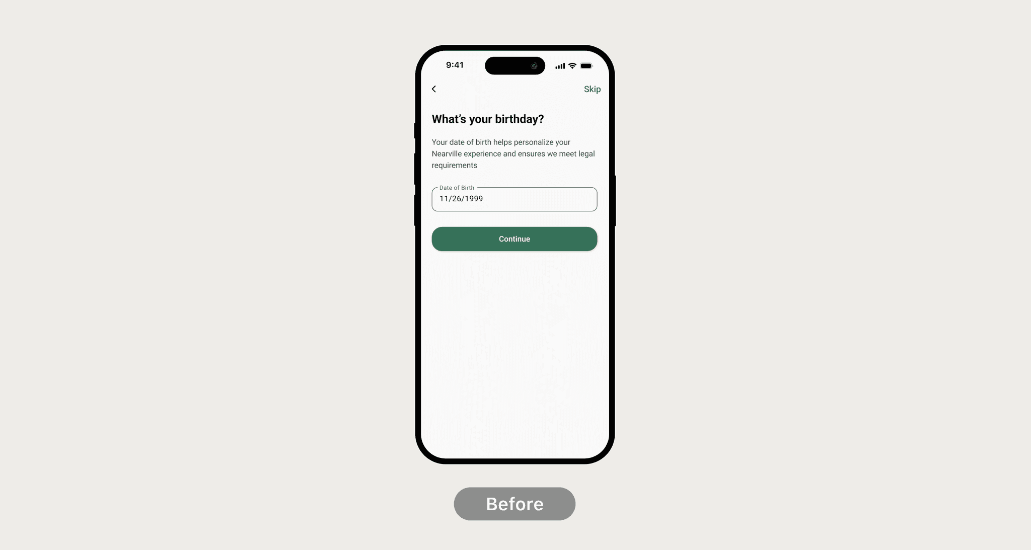
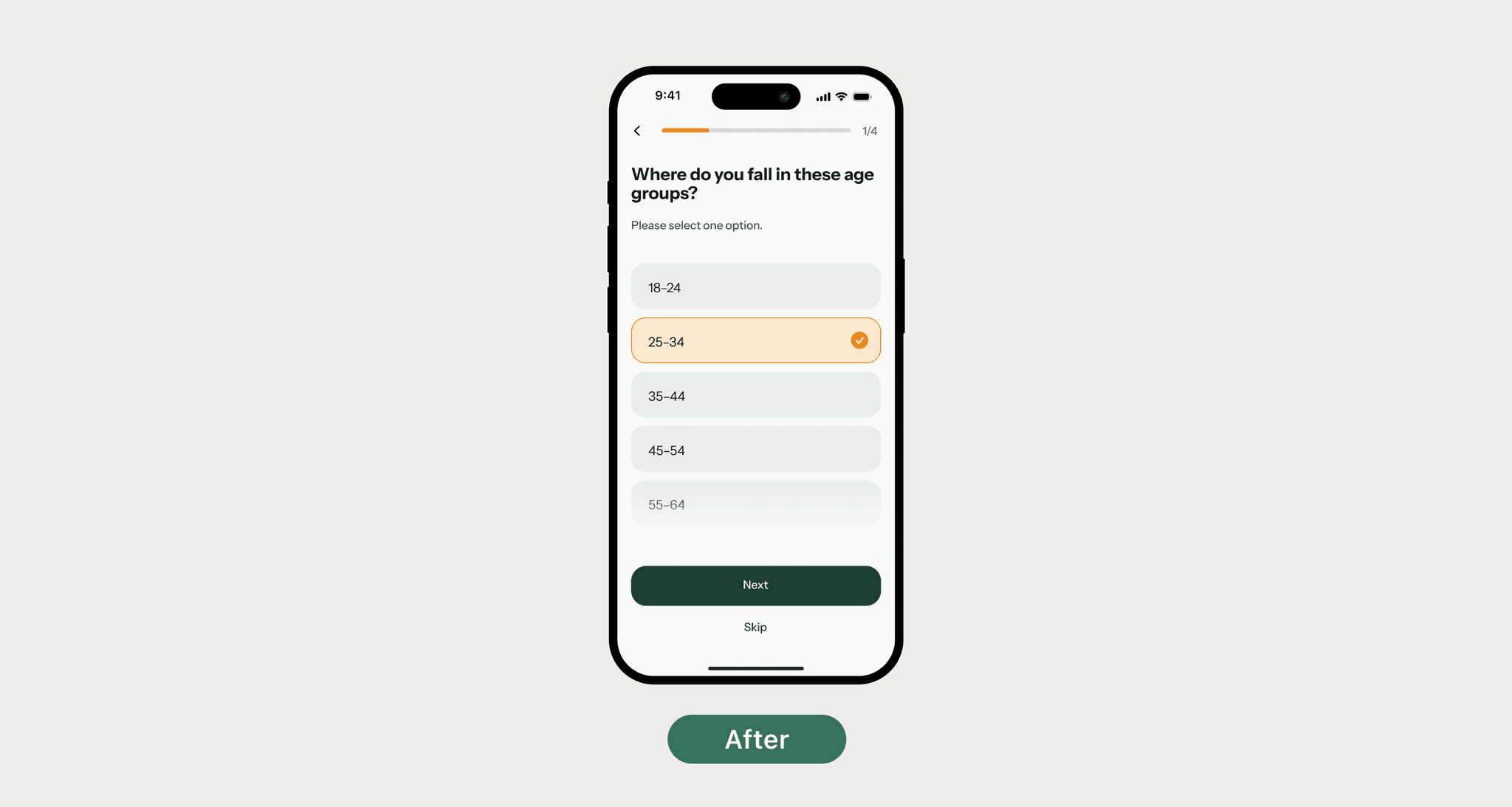
1. Reduced the cognitive and emotional burden of personal information input during onboarding.
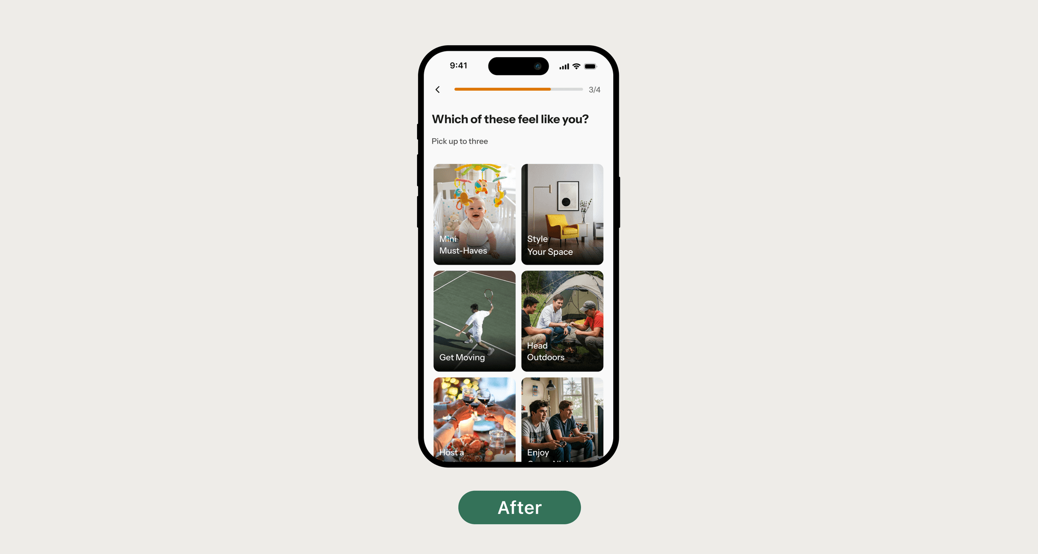
2. Make onboarding feel more engaging and lightweight rather than like filling out a survey
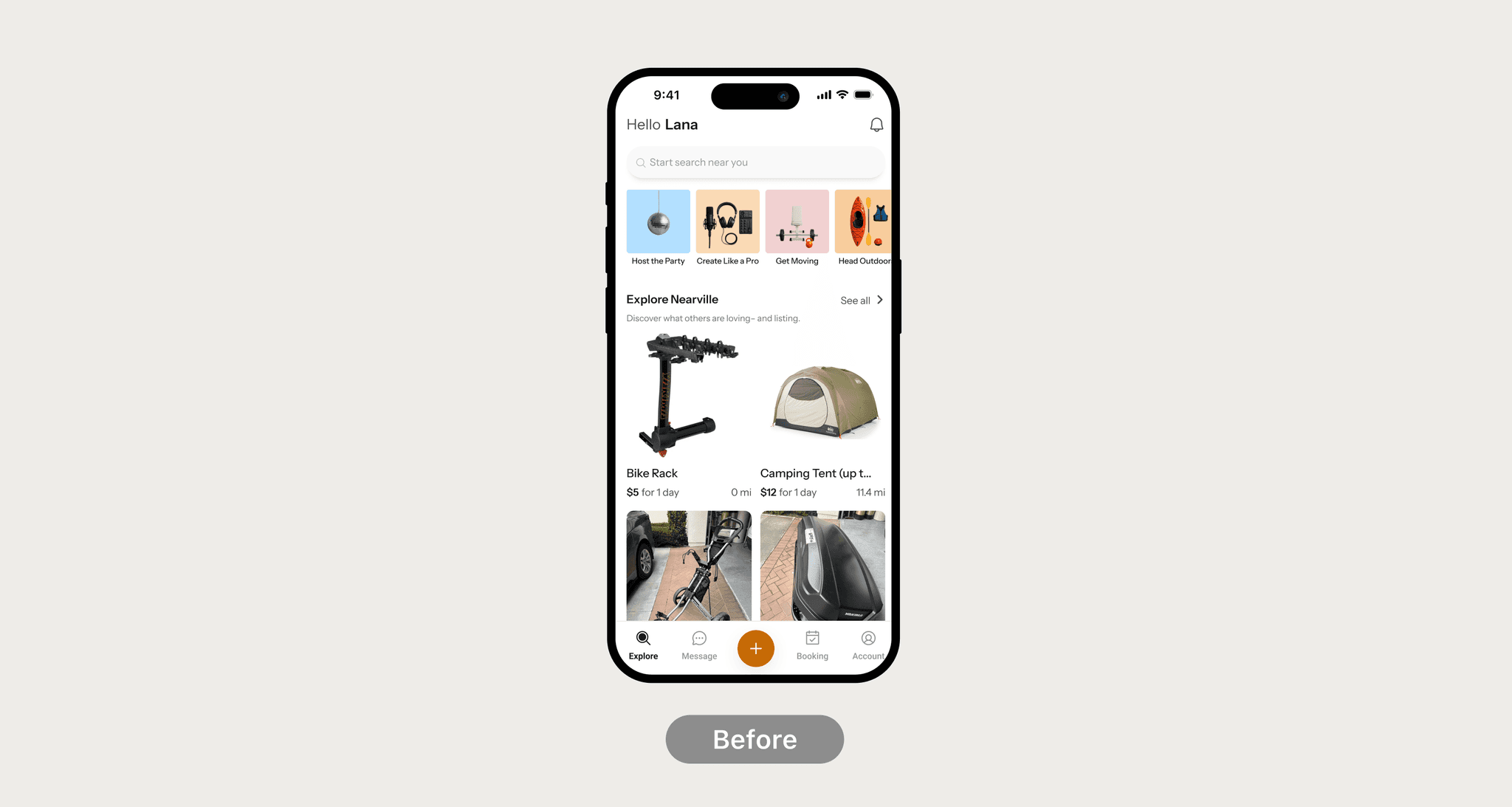
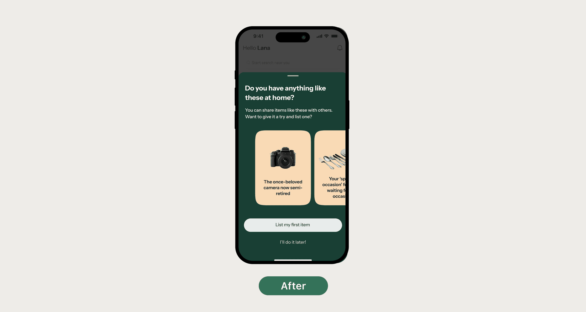
3. Guide users to take their first meaningful action right after signing up
Section 2 - Rebranding Nearville
Problem: Lack of Brand Clarity & Relevance
At the same time, our early brand identity felt disconnected from the experience we wanted to convey.
The visual language lacked coherence and failed to express the values we aimed to represent.
Users struggled to understand what Nearville stood for.
1. Outdated colors and typography
2. A generic, uninspiring tagline (“Borrow. Share. Save.”)
3. No clear emotional tone or personality
Design Goal
Optimize onboarding to reduce friction, build trust, and guide users toward meaningful first actions.
Outcome
1. Built a scalable design system in collaboration with the system designer and developers
2. Led visual redesign across website, app store assets, and social media
3. Strengthened brand perception “feels more mature and real” with stakeholder alignment
Before and After
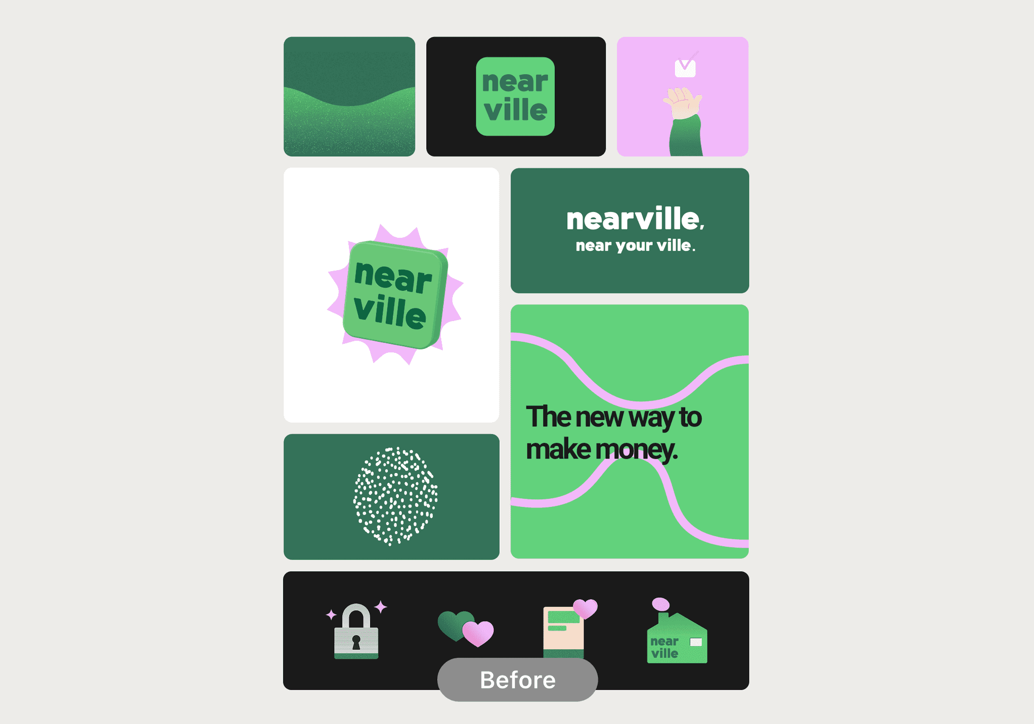
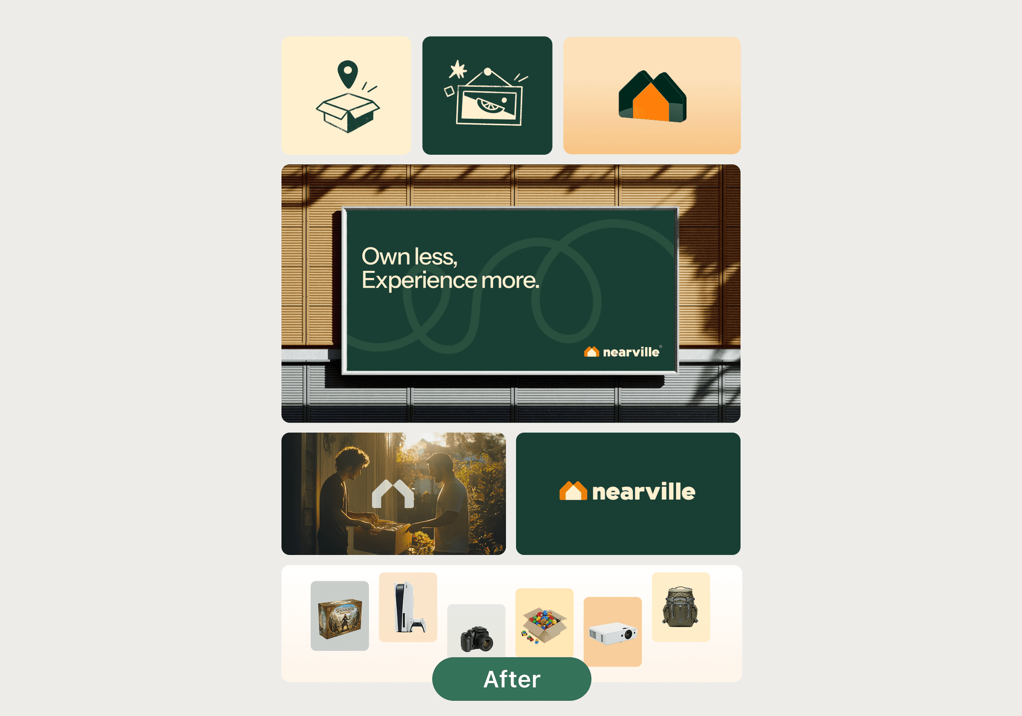
The previous branding primarily conveyed a sense of fun, sustainability, and youth, but failed to capture key values such as trust, community, and connection. I redesigned it to deliver a more mature and well-rounded brand experience.